

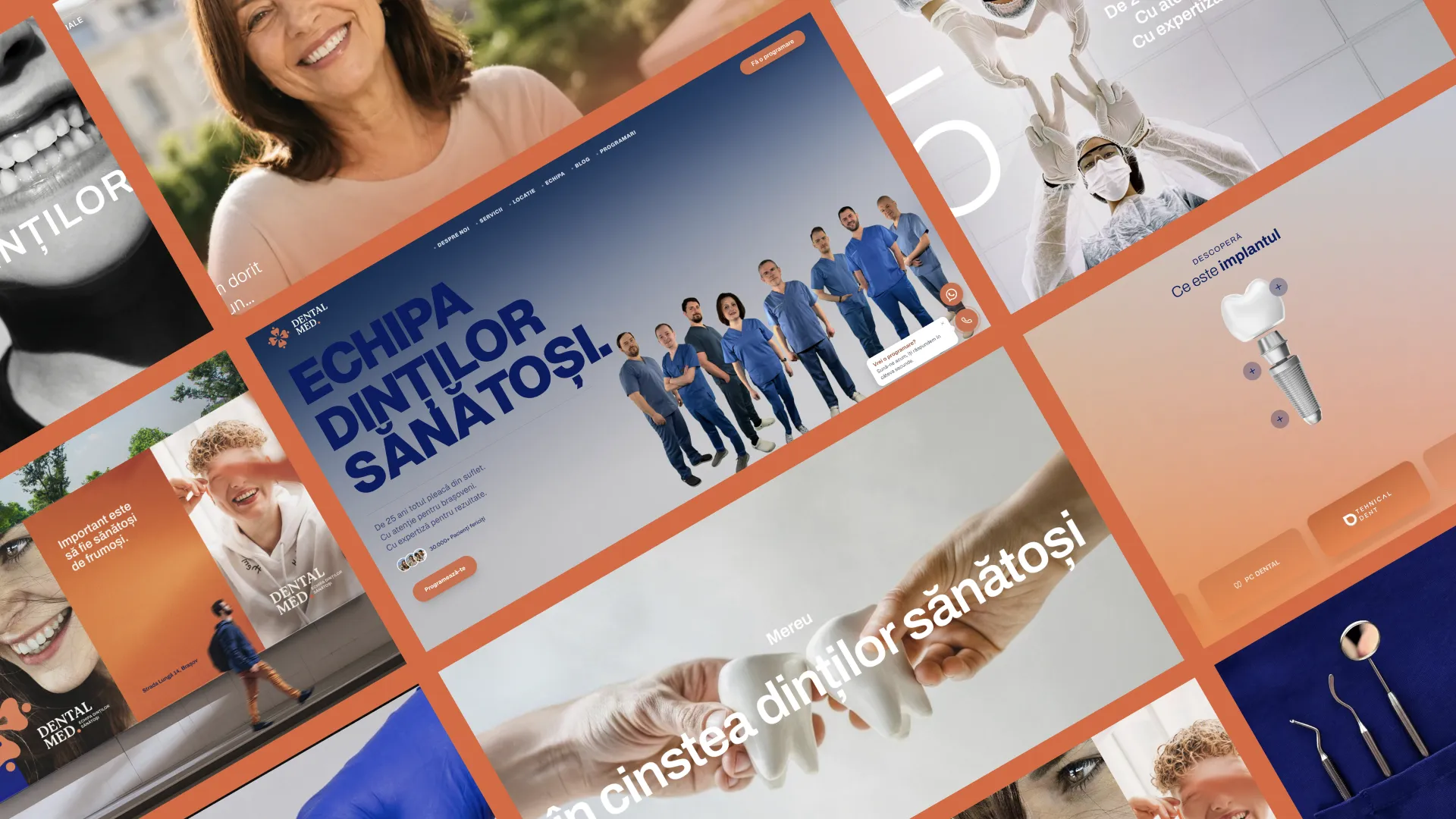
Branding · Web Design · Next.js Development · Social Media · PPC · Strategy
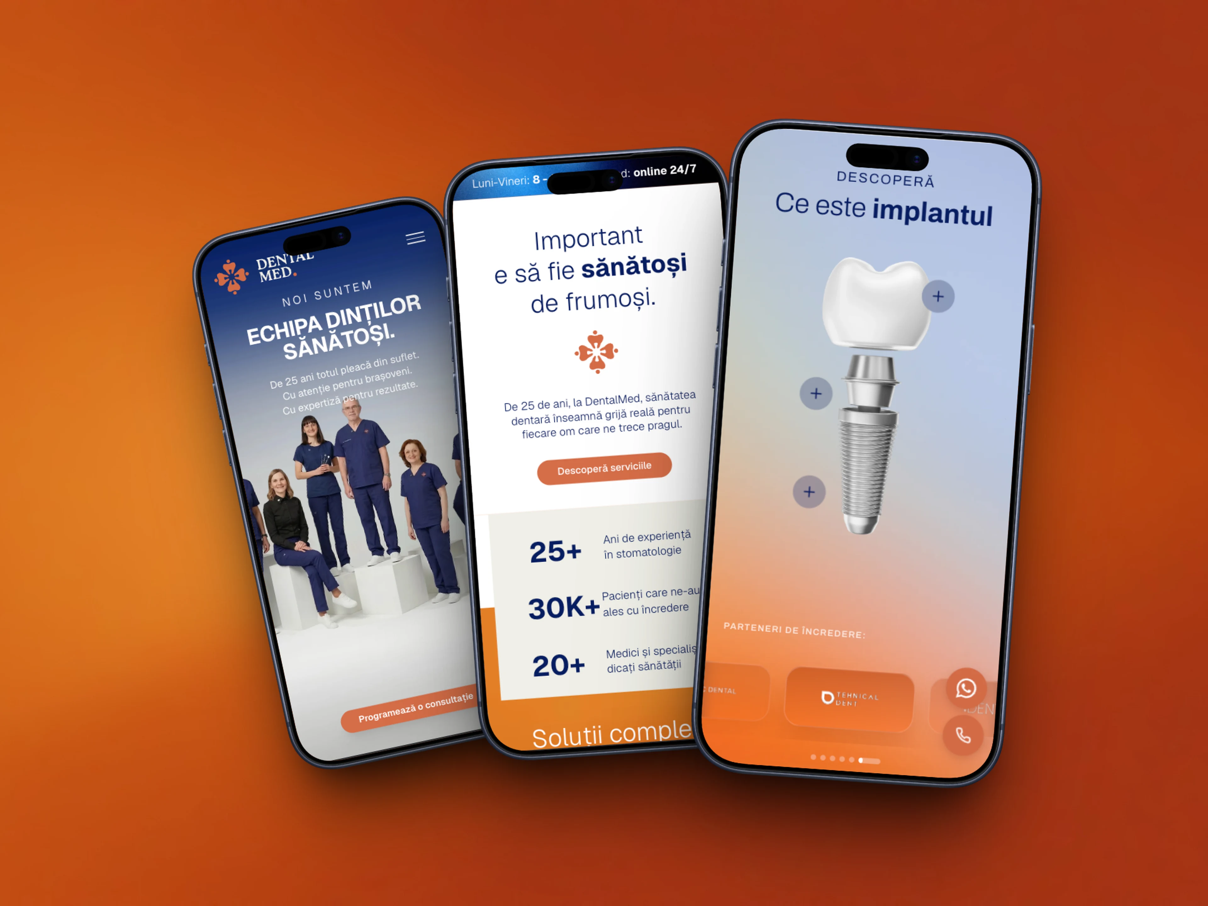
We rebuilt the visual identity and digital platform for DentalMed Brasov, an established clinic that needed a brand as strong as the quality of its dental care, and a website able to support real growth.
DentalMed is an established dental clinic in Brasov that needed a full rebrand: a new visual identity, a fast website and a coherent digital presence that matched the quality of the care delivered in the clinic. We started from a logo built specifically for the brand, not a generic template, and built a new Next.js website and Google + Meta acquisition campaigns around it.
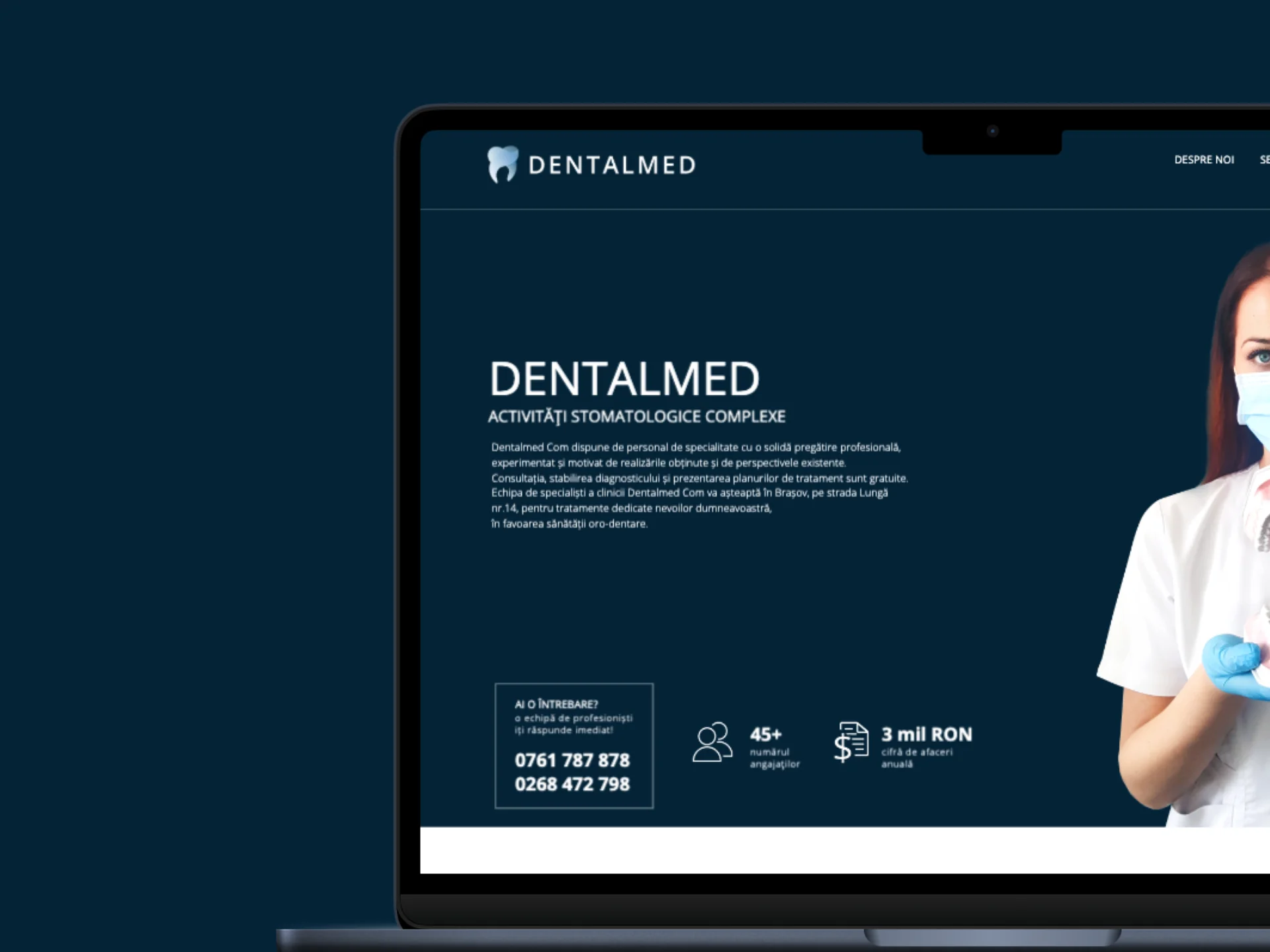
• The old brand didn't reflect the clinic's real level of care: a generic visual identity with no personality or differentiation from other clinics in town.
• The old website, built on WordPress, was unfinished, hard to maintain and impossible to scale for new services or pages.
• There was no coherent digital presence to support acquisition campaigns. Without a fast, clear site, ad budget had nowhere to convert efficiently.
• The clinic needed a system that could grow with the business, not a static site that requires a redesign every time something changes.
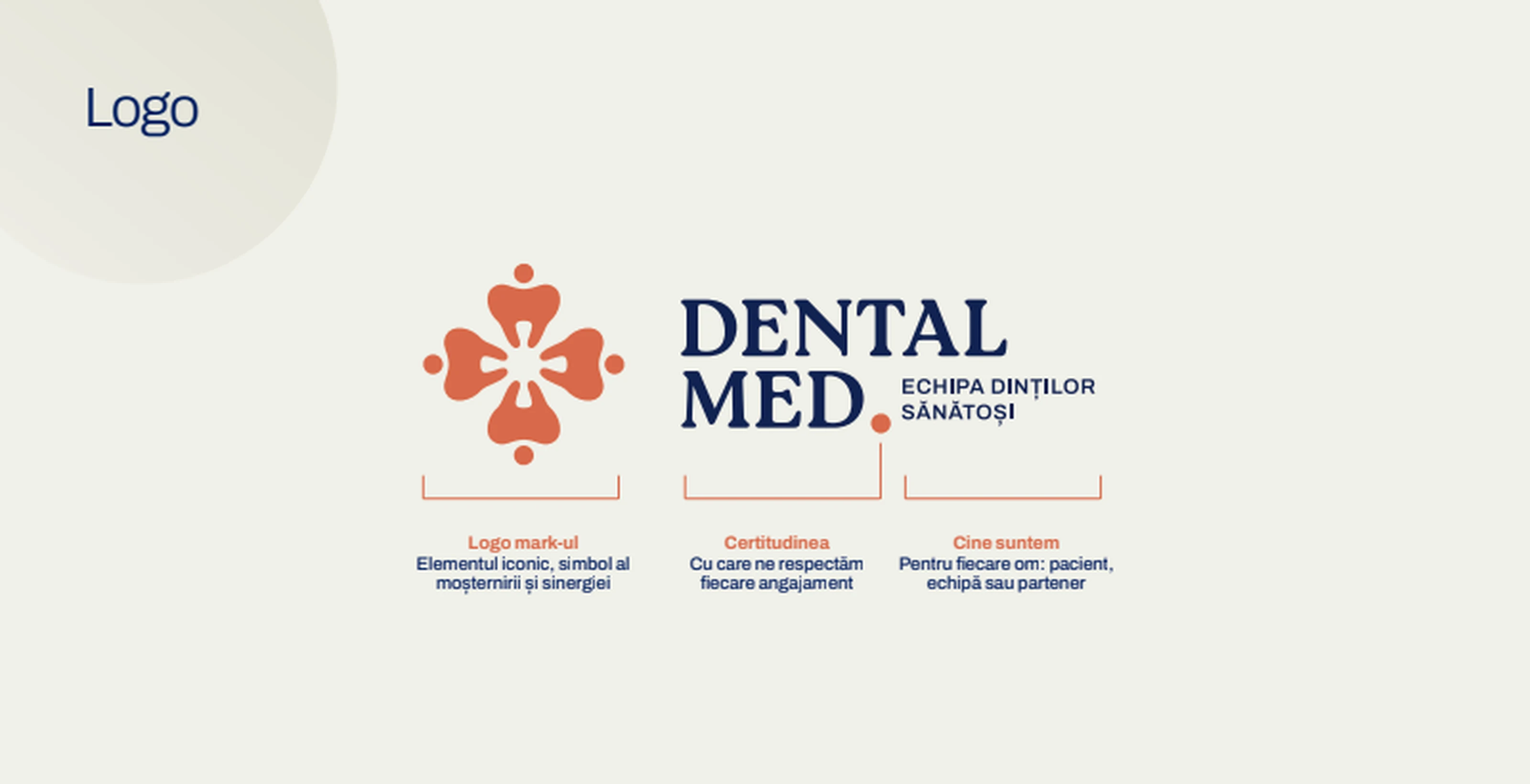
The logo is built around the ideas of collaboration, care and health. The composition conveys balance, closeness and continuity, the values that define how DentalMed builds relationships and delivers dental health care.
Together, the colors reflect the balance between expertise, care and safety, values central to the clinic.
In brand applications, Pearl is the dominant color and covers about 60% of the composition, offering space and clarity. Coral is used around 15% and introduces warmth, while Navy appears in a 15% proportion and brings depth, stability and confidence.
• New Next.js website, replacing the old unfinished WordPress site: fast, clearly structured and built on a clean technical SEO foundation.
• Google Ads campaigns to capture high-intent booking searches, paired with Meta Ads for awareness and remarketing.
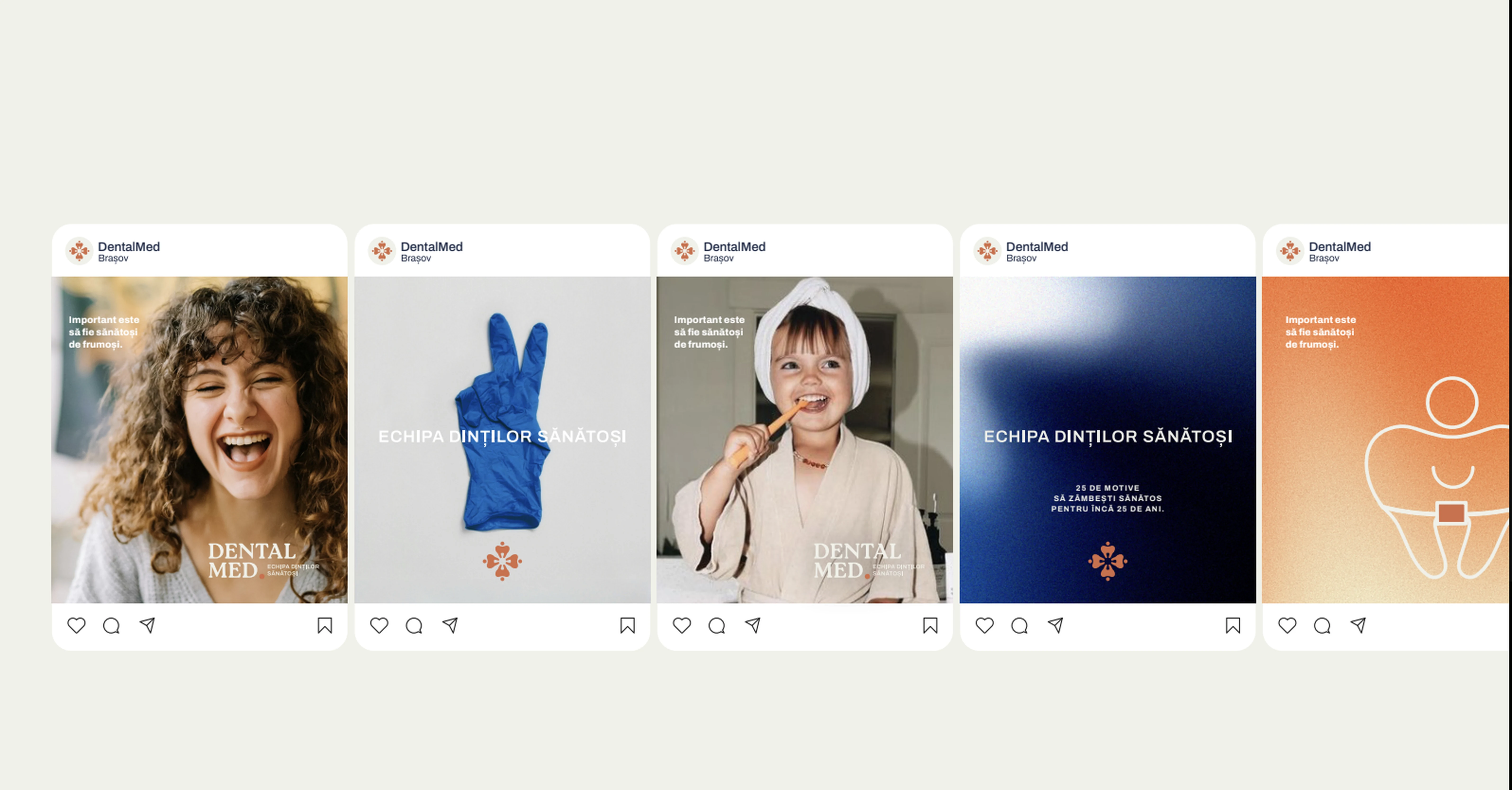
• Organic social content, visually aligned with the new brand, to build trust and local recognition in Brasov.
• Modular structure designed to scale: new services, new pages and future campaigns without a full redesign.
• Front-end rebuilt in Next.js, replacing the old WordPress site, for speed, stability and a clean technical foundation for SEO.
• Visual identity designed from scratch: logo, typography and a consistent visual language across website, social media and campaign assets.
• Performance-first build: optimized images, clean code structure and reusable components, built for Core Web Vitals.
• Conversion-focused structure: clear CTAs for bookings, clear service presentation and a frictionless contact flow.
• Marketing foundation: tracking setup, Google Ads and Meta Ads campaigns aligned with the new site's structure.
Book a 30-minute discovery call. You leave with a clear map of what the right architecture can do for your business.
Book the discovery call ↗